
Coco Love
Brand visual
style guide
Everything you need to put Coco Love in front of people the right way — logo, colour, type, imagery rules and the full approved image library. No sign-in, no folder hunting: press a button and it's on your machine.
01 — Identity
The logo
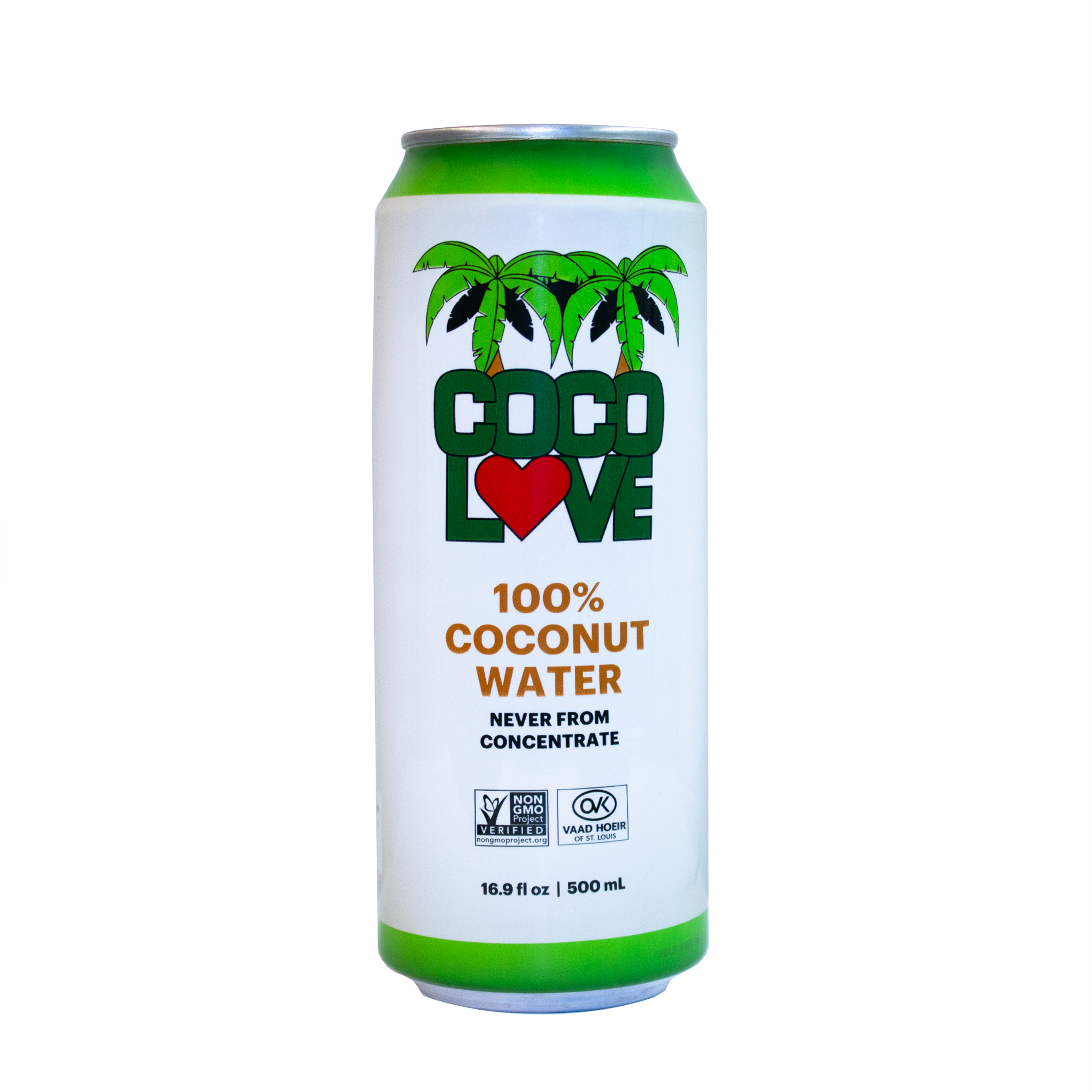
Two approved lockups. Use the horizontal lockup wherever space is wide and short — headers, banners, footers. Use the stacked mark for square placements, social avatars and stickers. Never redraw, recolour or add effects to the mark.

Primary mark — light backgrounds
Use on shell, sand or white. Keep clear space equal to the height of the letter “C” on every side.

Horizontal lockup — dark backgrounds
The white lockup is for green panels and photography. Place it on the calmest part of the image; minimum width 120 px on screen.
02 — Colour
Palette
Greens carry the brand; sand and shell give it air. Keep backgrounds light and let one green dominate per layout — deep green for authority, fresh leaf for energy.
Coconut Green
#046134
primary / leaf
Deep Forest
#18502B
forest
Fresh Leaf
#2DA525
accent / lime
Island Sand
#E5D9BC
sand
Coconut Shell
#FDFCF7
background
Ink
#1D2E24
foreground / ink
03 — Typography
Type system
Oswald sets the voice: condensed, confident, always uppercase for eyebrows and short headlines. Barlow carries every sentence — generous line height, never lighter than 300.
Display — Oswald
Pure coconut
Weights 500–700 · tracking +0.01em for headlines, +0.28em for eyebrows.
Text — Barlow
Coco Love is coconut water the way it comes off the tree: nothing added, nothing to explain. Write the same way — plain, warm and short.
Weights 300–600 · body 16 px minimum · line height 1.6.
04 — Imagery
Photography & renderings
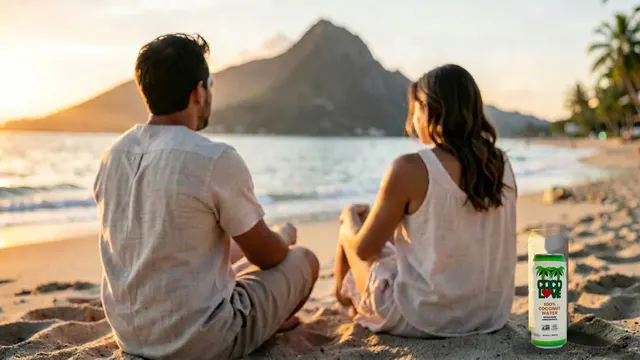
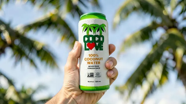
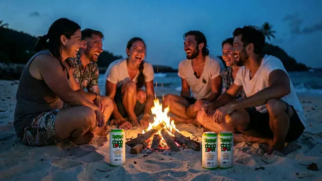
Every image in this guide comes from the Coco Love library — beach and island scenes, product renderings, retail displays. Sunlit, wet, real: water on the can, sand underfoot, one clear product in frame. Do not source outside stock or use portraits of people who aren't part of an approved shoot.

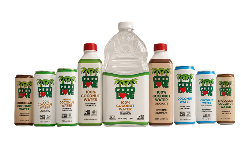
Product family lineup — always shown flat-on, evenly spaced, on a light background.
05 — Application
Do & don't
Do
- Let one green lead and keep backgrounds light and airy.
- Use the supplied cut-out renderings so cans stay crisp at any size.
- Keep headlines to a few words in uppercase Oswald.
- Pair every claim with the product actually in frame.
Don't
- Stretch, rotate, outline or add shadows to the logo.
- Recolour the mark or place it on a busy part of a photo.
- Mix in outside stock photography or unapproved people shots.
- Set body copy in Oswald or headlines in a font outside this guide.
06 — Downloads
Image library
98 approved images, grouped and ready. Every tile has its own download button, and each group can be grabbed in one go.